Going through the process of designing a game can be a real adventure. Let us tell you the story of our journey while developing the game.
The Journey of Catronauts
-
Design Jam and First Concept
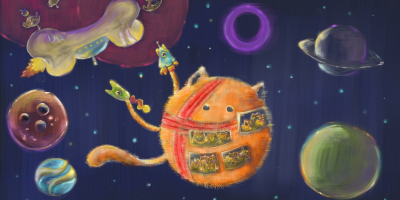
Catronauts came out of a 48 hours design jam game called Space Race. Space Race was a competitive multiplayer game for kids aged 6-12 years old, in which players controlled spaceships and had to collect an element from each planet in our solar system and bring them back to earth. Afterwards, to make the game more fun and original, we rethemed the game to be about collecting cats and renamed it Catronauts.
-
Conception Phase
When our client approached us and gave us the opportunity to redevelop and expand the game, we had serious reservations. The design jam game was designed to be a 5 minute experience and lacked any meaningful gameplay depth. Also our client challenged us to solve a problem so we focused a lot on that at this stage. As we started exploring a broad range of options, everybody on the team began pitching game ideas. We couldn’t agree on which one we would go with so we had to repeat this process again and again for almost a full week. It was important for us that all team members feel motivated by the project we would be working on.
-
First Pivot: Pillage Party
After many days of brainstorming sessions, we collaboratively created a great and very original idea: a mobile game about pirates called Pillage Party! This game was about bringing couch coop and VR to mobile devices and featured asymmetrical, fluid roles. We were very excited by this game because we were finally solving a problem, and also because it seemed very fun. Everyone was on board… except for our client. He made it clear that Catronauts as a brand was considerably more unique than pirates. Additionally, his desire was for us to develop a game based on proven game mechanics. As Catronauts’ mechanics of maneuvering ships through space with gravity had already proven to be fun, this was a stronger basis to build a product in his opinion. With this in mind, we quickly reverse pivoted back to Catronauts!
-
Second Pivot: Catronauts 2.0
Once we were back on track, we still needed to expand the core of Catronauts’ gameplay, while taking care to maintain its fundamental game elements of multiple players controlling spaceships in a kid-friendly, cat themed game world.
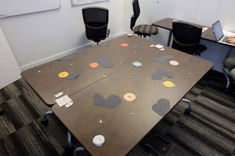
We started experimenting with a paper prototype that featured some new ideas that could extend the game to a longer experience: cooperative play, shooting and shared control of a mothership. User testing of this paper prototype validated these ideas and launched the development of Catronauts 2.0.
We structured our development into 4 two week sprint cycles. During these sprints, we digitized the game and gradually introduced enemies, obstacles, abilities and UI elements. At each stage we sought to emphasize design choices that encouraged cooperation, and we regularly conducted user testing to measure our progress in achieving this goal.
-
Sprint 1: Minimum Viable Product
Design and Development
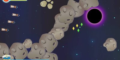
This sprint was about developing the minimum viable product and the core of the game. Within this two week period, we produced both a paper prototype to test the concept, and a rudimentary digital prototype that enabled us to find the right controls and the core mechanics of our game. We developed the digital version of the mothership dragging and shooting mechanics, as well as the camera movement so that it would be possible to design larger levels. We created a simple demo level in which you could shoot stationary asteroids and in which you had to reach the Earth. We used stand in assets sourced from Catronauts 1.0 to do this.
User Tests
We experienced a major pivot before we started this first sprint. The game concept we pitched was aborted and we re-designed our game concept and mechanics. We first started with designing a multiplayer competitive board game based on our basic mechanics — moving, dragging, attacking and gathering power-ups. We conducted a formal user test on the board game, of which the positive result solidified our game concept and gave us the confidence to develop it further. However, it also changed the game from competitive multiplayer to collaborative multiplayer.
At the end of this sprint, we conducted another formal user test with our digital prototype, described in the beginning of this section. The feedback we collected from the interviews commonly reflected that the control of players’ small ships was not intuitive. Although our basic mechanics of shooting and dragging turned out to be fun, our testers struggled controlling their spaceships when they tried to turn and decelerate. From a UX perspective, we became concerned that the control system would be difficult for children. Given our objective of appealing to both children and a broader base of adult gamers, the design problem became how to design controls that would be intuitive for new and casual gamers, but sophisticated enough to satisfy mid-core and hardcore gamers. Thus, we decided our focus of the second sprint should focus on improving the controls.
-
Sprint 2 : Let’s Make it Fun!
Design and Development
At the end of the first sprint, we received a very existential question from our client: “What makes your game fun? I want you to prove me that your game can be fun!” So, in addition to explore different control schemes, this sprint was all about discovering the fun in our game. We developed the dog enemies, the moving asteroids and the asteroid spawners. To make cooperation more present in the game, we added a shield to some enemies so that players need to collaborate to defeat them.
User Test
At the end of this sprint, we conducted a formal user test on our second digital prototype. We designed an AB test for two sets of control schemes, since the control was the most challenging part users found in the last sprint’s user test. Our assumption was one set of control would suit casual gamer, and the other would suit mid-core gamers. The result was almost a tie after we asked testers to choose their preferred control scheme. At the end, we decided to use the scheme designed for casual player. We also conducted an AB test on art assets of cat spaceships and mothership to acquire testers’ opinions on which option was more recognizable and appealing.
By reviewing the interview data, we noticed the preference for the control scheme B is 20% more than the control scheme A (see chart below). We also brought the issue to the class daily to ask for more people’s opinions. Considering our target audience, which is children from 8 to 12 years old, we decided to continue the development with control scheme B preferred by more casual gamer testers.
-
Sprint 3 : Abilities, Powerups, Levels!
Design and Development
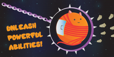
For the third milestone, we started creating unique abilities for the players and added black holes. We also started creating parameters to the game objects so that our level designers could start designing level inside Unity without the need of the programmers. During this sprint we designed the two bigger levels we used for the beta test. The ability developed at this stage were: the gravity push, the shield, and the wrecking ball. We also developed the collectible powerups and the energy bar.
User Test — Test with Kids
While we continued QA testing our evolving digital prototype with our peers in the cohort, we focused the formal testing of Sprint 3 on two areas: research with children and parents, and a survey on monetization.
We had the opportunity to conduct a test of two of our persona groups, children and parents, on November 14, 2016. Our test subjects were Olivia (age 11), Jack (age 8), Emma (age 5), and Kathy (age 40). They are an upper middle class family in North Vancouver who play mostly casual mobile games. The most experienced game player in the family, Jack, only played console games at friends’ homes, and his favourite game is Pokemon Go.
Unlike our previous tests, which were conducted in somewhat artificial circumstances within the Centre for Digital Media, this test was more ethnographic in nature, as it allowed us to test our primary target demographic within their home. This test allowed us to observe the natural behavior and dynamics the game produced in players, particularly between children playing together, and parents playing with their children.
This test was an overwhelming success in proving out a number of standing concerns for our team. The first was the useability of the game. Previously, we had assumed that the control mechanisms and mechanics were perhaps too complex for children under 8 years old to understand. We also feared that children who did not have previous experience with Xbox controllers would struggle with the learning curve. All three children understood how to use the controllers within minutes. Kathy, their mother, also understood how to use the controllers, though sometimes relied on the “cheat sheet” of written instructions we provided. Initially, Jack and Olivia found the game too difficult, and we adjusted the parameters of the HP to increase their health. However, within two plays of the game, they played well enough for us to return the HP to normal settings. Within half an hour, Jack was requesting more difficult levels. This reaffirmed that gradual learning through gameplay, rather than watching a tutorial, would be effective for children. Emma, the youngest, is unable to read and her mother said that she appreciated that Emma could play without this barrier. However, the children reported that lack of a win screen and feeling of celebration upon winning negatively affected their experience, emphasizing the emotional impact of this future UI development.
-
Sprint 4 : Feedback and Polish
Design and Development
This sprint was the best opportunity to fix the main issues in our game before the final delivery. It was in this period that we inserted the majority of our updated art assets and UI elements. We relied heavily on the previous feedback for this sprint. For example, the majority of players reported that the mothership health bar was unclear, so we added different damage states for the mothership asset. We also added a cat commander, which came from the attempt to solve two big problems heard in feedback: not enough presence of cats, and unclear mission objectives. As a UI element, the cat appears near the start of the mission, filling ⅓ of the screen, and supplies the objective of the level, while also giving helpful instructions, and pieces of the narrative. Another feedback problem we solved is the shooting cooldown, as some players were holding the fire button at all times. We needed to somewhat disincentivize this behaviour, which the cool down achieved. This sprint also allowed us to focus on the co-op abilities and social experience. At this stage, we added the four player functionality, which the beta test revealed transformed the social experience into more of party environment. We adapted the level design to make it possible to be “surrounded” by enemies, forcing players to work together to use their co-op abilities. We also added a fourth ability, the super-canon, which proved to be even more popular with players than the wrecking ball. The beta test revealed that we still have some distance to go in order to optimize the co-op abilities, that will need to be considered for future development of this game.
User Test — Beta Test
With the user flow established and most of the design implemented, we conducted the beta test with this newest version of digital prototype. We set up two test rooms, one formal test room set up with a comfortable environment similar to a living room, and one ‘free play’ room without any team members present. Formal user tests with maximum four players per game play were conducted in the play test room. With four player functionality being a new feature, and with considerable demand to play our game, we decided to test eight groups of play tests, with four players per group. We polished two medium-level difficulty levels with the menu system embedded into the game. Players went through the new flow of game from the start menu, then choosing number of players, selecting the level, after gameplay opting to re-play or continue to next level. In this way, we were able to observe the players more naturally without interfering players’ flow or asking directly if they would like to continue playing the game.
Our testers includes graduate students, professors and experts from the game and related industries. In terms of the tutorial, the instructions were both written in large font on the whiteboard adjacent to the players, and delivered verbally, gradually to build knowledge of the controls, and then the abilities. We received a lot of positive feedbacks and comments, only a few players reflected that the test levels were too difficult. On average, it took players two attempts to complete the level, and only one of the 8 teams did not complete the level. 71% of players opted to play again without prompting, or vocalized that they wanted to play again. 31% chose to play a more difficult level, after succeeding with our entry level.
The most popular element of this game related to the experience: the social interaction between players, and the excitement of the fast pace and chaos. The basic mechanics were also popular, but that may have been due to failures with the tutorial. Indeed, many of the least favourite elements of the game may have related to the insufficient tutorials: problems experienced with the controllers, the challenge of cooperating between players to coordinate abilities, confusion on how to use the special abilities, or understanding the meaning of the mothership health HUD. All of these factors have driven our decision to create the cat commander, and gradually feed tutorial information through pop up elements that teach gameplay but do not disrupt the flow of the game.
Surprisingly, the special abilities were cited as the weapons used least often. Generally this was associated to insufficient tutorials or developing better couch communication as a team. Three playtest groups recommended specialized roles for individual players as a solution to this problem, which could be explored as a future mode.
Another valuable suggestion that came forward from two playtest groups: enhancing the competitive dynamic between players by reporting stats on the win screen: which player shot the most dogs? Which player collected the most powerups? Which player was the best at coop abilities? Badges would serve as an excellent motivator, which could also be incorporated within future monetization and marketing plans.


Leave a Reply